Peter Obi’s Campaign Poster: A Simple Critique Using Formal Analysis
Peter Obi’s Campaign Poster: A Simple Critique Using Formal Analysis
On a normal day, we look at posters, fliers and other print adverts as just ways of sharing information but it is usually more than that. These things communicate different messages and if we look beyond the obvious, we would notice hidden messages and little encoded messages to uncover. In this critique, I would be looking closely at Peter Obi’s campaign poster for the 2023 presidential election, I will examine key visual elements like color, typography, image placement, and symbolism. We would be focusing on how its design communicates political values, leadership identity, and national unity. Each part of the poster has been chosen to send a message to voters, from the use of Nigeria’s national colors to the Labor Party logo and thumbprint symbol. The poster’s simple but powerful design shows Peter Obi as a leader who stands for hope, peace, fairness, and development. In this analysis, I will explain how these designs that have been chosen work in unity to present Peter Obi as a people- centered and trustworthy candidate.
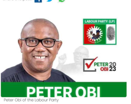
Firstly, the colors chosen for Peter Obi’s poster are symbols of hope and pride for the nation. This is because the is main colors on the poster are green, white, red, and black. As we all know, Green and white are the colors of Nigeria’s national flag. These colors were put in the poster to remind the people that there is someone out there like Peter Obi who still cares about our country. To start with, the green color has always been a symbol of growth and development, so it is quite important for the future of Nigeria as a whole. Then we have the white which signifies peace and unity within the Nation which is what Nigeria really needs at this time to be honest. The red color from the Labor Party logo (LP) is there to show the energy and strength Obi is bringing in if he was to win the election, emphasizing on the fact that the campaign wants to obviously bring good change fast. Then we notice the Black and ask ourselves, why? This is because Black is used simply to make text and elements stand out clearly and bold showcasing Obi’s aura. By using these colors, the poster connects Peter Obi to Nigeria’s identity and shows that his campaign is about unity and progress. The simple color plan also makes the poster easy to read and eye-catching. This helps the poster speak to both educated people and ordinary Nigerians in markets, streets, and villages. The colors quietly tell people that Peter Obi stands for hope, peace, and action.
Additionally, the typography on the poster was made to make Peter Obi look serious and strong This is to convince the people that he is who they need as President to rely on and relay all our problems to like father figure in a family. Also, words on the poster are written in bold and clear letters. The name “PETER OBI” is written in big capital letters, so people can see and remember it easily. This tells us indirectly that he is confident in his ability and ready to lead the nation. The use of capital letters gives the message that Peter Obi is not hiding or trying to confuse people but showing them all versions of himself, being real and connected to the people. Everything is clear and direct. The font is modern, clean and without extra designs, which makes it easy for people to read at a glance and still undoubtedly get the message. This simple typography shows that the campaign is not an empty bucket making useless noises i.e. about hollow promises. Rather, It is about getting things done. The size of the name also makes sure that people’s eyes go straight to the most important information which who to vote for- Peter Obi, no mincing of words. All in all, it is clear the poster uses typography to send a message of strength and readiness to serve.
Similarly, Peter Obi’s photo is placed on the left side of the poster on purpose so it is big enough to be the first thing people see when they look. In the image, he gives a small friendly smile that is warm enough to make anyone who looks at the poster to feel connected to him. His glasses, simple clothes, and calm look make him appear serious but approachable. The image is clear and not mixed with too many other designs, so people can focus on him as a person. By putting the image in this way, the poster invites people to see Peter Obi not just as a name, but as a leader they can trust. This placement of the image on the poster helps creates a feeling of trust and also makes the poster look clean and professional, which automatically builds confidence in his leadership.
Furthermore, the symbols on the poster shows that the campaign isn’t just for the good of the candidate himself but about the people. The poster includes the Labour Party logo, which shows a gear and a family. When we interpret this, it stands for hard work and protection of the interests of people. The gear reminds voters that this is a party that focuses on jobs and workers’ rights and the family in the logo shows that the campaign cares about everyone. There is also a thumbprint symbol, which prompts people to be good citizens by going out to vote during election. This is important because not everyone is educated and for being considerate by adding that little symbol, he has won the vote of many. There is also a check mark next to his name like a ‘demure’ way of telling people to pick Peter Obi as he is the right choice for the people. These symbols work together to send a message that Peter Obi stands for fairness, family, and change for Nigeria.
In summary, the whole design of the poster sends a message of unity and new leadership. When we look at all these elements together, we see that the poster is not trying to confuse or impress with too much design but neat and balanced. Everything works together to show that Peter Obi is a leader who cares about Nigeria. Peter Obi’s campaign poster uses simple but powerful design to pass a strong message. The green, white, and red colors link him to Nigeria and to hope for the future. The bold, clear letters make him look confident and ready to serve. His friendly photo builds trust, and the Labour Party symbols show that the campaign is about workers, families, and fairness. Altogether, the poster gives people a feeling of hope that Peter Obi can bring positive change to Nigeria.
Comments
Post a Comment